VistaPrint
Improve content hierarchy to boost revenue
How I revised VistaPrint's "Design Review" step to increase completion rates by 37% and mobile revenue by 8%.

Role & duration
Content Designer
2 months
Tools
Figma
Optimizely
Usertesting.com
Methods
Heuristic evaluation
User research
UX writing
Content hierarchy
Visual hierarchy
Overview
In a world where any person can design anything, we risk making mistakes.
VistaPrint's Design Review step gives users a moment to correct mistakes before they print.
However, the placement of certain affordances caused users to abandon their project, and VistaPrint to lose revenue.
In this project, I revised the visual hierarchy to meet user expectations and enter the purchase flow.
Product flow
From the Home Page, a user should navigate to the Gallery, through the Product Editor, to the Cart.
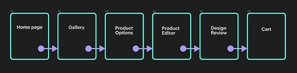
The mobile view looks like this:

Problem
Users return to edit
Our user data showed that more than half of our users navigated back to the editor from the Design Review page.

Then they drop-off
Many of these users would then abandon their project without making any changes.
What is it about the Design Review that encourages users to backtrack and bounce?
Process
Step 1: Audit
-
Document the user flow
-
Review user data
-
Identify opportunities
-
Evaluate the competition
Step 2: Rewrite
-
Produce explorations
-
Propose content improvements to UX designer and product team
-
Incorporate the team's feedback
Step 3: Validate
-
Test the new flow with users
-
Review data
-
Incorporate feedback
Step 4: Launch
-
Get sign-off on final copy
-
Share the final copy document with the developers and localization teams

Heuristic Evaluation
To identify opportunities that improve the content design, I evaluated the Design Review page for accessibility, consistency, and best practices.

I collaborated with the Engineer and Localization teams to publish simple updates to the UI copy.
The "Edit my design" button was a stickier issue. The UX Designer and I enlisted the help of User Researchers to learn how users understand this action.
User validation
What do users expect to happen?
The UX designer, UX research team and I gathered qualitative data to learn how users interpreted and navigated the interface. Together, we ran 10 in depth interviews and 18 unmoderated impression tests.
These tests revealed something interesting.
Users understood "Edit my design" as "go back" to make changes.

User test participants understood the "Edit my design" button would return to the previous screen.
I included the question, "What do you think will happen if you hit the button in the lower right?"
Most participants replied "it would take me back" or "go back" to make more changes.
Users unintentionally hit "Edit my design" because it's convenient

Despite the clear label, many users hit the button in the lower right corner when they were "done." Test participants inferred a different functionality based on the look and position of buttons.
For example, mobile users often expect a button in the lower right to take them to the next step.
These users intuitively hit a button conveniently placed in the lower right corner to navigate to the next step.
Users who unintentionally returned the editor reported feeling frustrated and confused.
Solution
I recommended lowering the visual hierarchy of the action to make it appear less important to users.
Instead of styling this action as an "Edit" button, I present it as back navigation.

Visual hierarchy that meets the user's expectations

Back navigation
-
"Back" aligns with our user's mental model of "returning" to edit
-
Users who want to navigate forward are unlikely to accidentally hit it
-
Users who want to go back to edit are likely to find it in the navigation bar
One button
-
The only available button navigates to the next step (the cart)
-
1 button helps focus user behavior
-
Users who want to navigate forward are likely to intuitively hit it
Results
The new visual hierarchy removed the unnecessary friction and frustration our users previously experienced. Users who were ready to add a product to cart were able to quickly and intuitively hit the "Add to cart" button.

Design completion rate skyrocketed to 37% and mobile sales increased 8% with an impact of $1.2M in annual revenue.
In retrospect
By tweaking the visual hierarchy to meet our user's expectations, we were able to keep users who would otherwise bounce.
The Design Review page offered friendly friction to help users create the printed products they want. However, some competitors forgo this step for contextual alerts to print issues before the users leave the editor.
The VistaPrint team updated the editor to include AI assisted spell check. I imagine expanding this to include gentle alerts in the editor interface to prompt users to fix mistakes where they can make changes.

